Every day, black magic is performed in offices; mysterious numbers appear on-screen as if directed by an invisible hand. The tool for such a magical performance is called Excel. While I use it for simple budgetary needs, I do not excel at using it (scnr) and admire everyone who knows how. To this day, it still looks like black magic to me, and I rather prefer excelling (sorry-not-sorry) in the art of taming Pythons.
Recently I was given the chance to attend the SANS FOR578 class on Cyber Threat Intelligence which was a delight in itself. The other delight consisted of lessons in black magic – using Excel to create pivot tables and cast other spells. Meanwhile, Python has gained a strong presence in data science, and as a Pythonista, I wanted to solve some of the exercises using Python instead. Additionally, data sets are becoming so big that manual work in Excel simply leads to nowhere. I have only shallow experience in data science, so I considered this a useful challenge.
What follows are some notes on translating a couple of Excel tasks into Python which are also related to CTI. I am a bit familiar with pandas, and used GenAI to quickly generate prototypes and then refine them into what I was looking for.
Note 2026-02-01: This blog post was written with pandas 2. Pandas 3 introduces easier ways to access data using pd.col().
Notes on the Code Snippets
You can find Jupyter Notebooks of the simple queries and the heatmap in this GitHub repo. The Jupyter Notebooks all create fake, randomized data that do not in any way correlate to the class content. They are all common tasks in Excel.
- The simple queries create a fake data set with cheese types sold on a particular time and month.
- Another data set contains fake username-password combinations and IP addresses reserved for example code (RFC5735).
- The heatmap uses a selection of Chinese zodiac animals linked to a random year-date combination.
The snippets below are just the most relevant parts to answer the question without any setup. For that, see the whole Jupyter Notebooks.
Simple Queries: Frequency Analysis
Which was the month with the highest sale and latest time sold?
|
|
What was the month with the highest sales?
|
|
Simple Queries: Search Data
Search for an IP address, first with equals, then as substring search.
|
|
What are the two most common passwords?
|
|
Search for an IP address across the whole data frame.
|
|
Search the username column either for god or toor then get its corresponding password.
|
|
Pivot Table and Heatmap
Generate a pivot table out of a data set, where rows are dates and columns are the Chinese zodiac animals. Count occurrences as aggregation function.
|
|
Create grand totals:
|
|
Now to the heatmap. In the task, the grand totals were not part of the heatmap itself and uncolored. Which means: Generating heatmaps in Python is easy. Generating heatmaps in Python that look like the one in Excel is difficult. I used GenAI to quickly create a prototype. Then followed the familiar rabbit hole of a hallucinating GenAI when I wanted to have the grand totals not included in the heatmap coloring.
After many very-similar-yet-different questions to The Cheery Robot that is GenAI, I found an answer on StackOverflow. It uses one heatmap as a mask over the other. Let’s create the mask:
|
|
After some trial and error with a visualization library called seaborn, I achieved my desired result using the mask:
|
|
… and can now present this lovely heatmap that is not Excel:
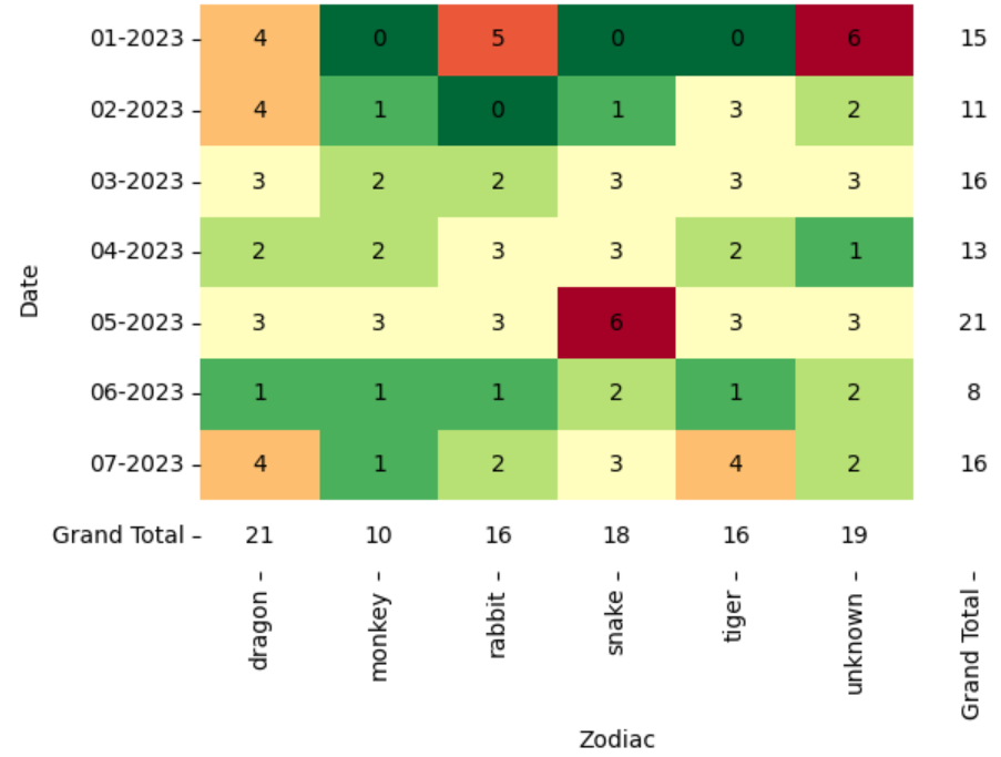
A heatmap! With grand totals in white!
Here’s again the repo with the full code: cti-with-pandas
Image source: RealVisXL/Nightcafe
Last modified on 2025-02-21
Comments Disabled.